Custom Visor Artwork: How to Prepare a Logo That Fits the Front Panel
Custom visor artwork works best when the logo is wide rather than tall, uses bold shapes and few colors, and is approved on a mockup before production. Customized Visors redraws your file onto the actual visor style you choose, sends a free mockup within 24 hours, and makes unlimited revisions until the front panel, side and brim placements look right.

- A visor front panel is short and curved, so wide horizontal logos read best.
- Embroidery favors bold shapes; printing handles finer detail and gradients.
- Customized Visors sends a free mockup within 24 hours and revises it until you approve.
- You pay nothing until you approve the design; minimum order is 12 visors.
- Standard turnaround is about 2 weeks after proof approval.
Why is visor artwork different from cap or shirt artwork?
Visor artwork is different because a visor has no crown. On a custom visor, the entire front decoration area is a narrow, curved band of fabric that sits above the brim and wraps toward the temples. A logo built for a tall cap crown or a large shirt chest usually looks cramped or tiny when it is dropped onto that band without adjustment.
The band also bends in two directions: it follows the curve of the forehead, and it meets the brim at a seam. Artwork that runs too close to the brim seam or the side edges can look crowded or get distorted as the fabric curves. That is why Customized Visors places your logo on the specific visor style you pick, not on a flat template, before you ever approve a proof.
The practical takeaway is simple. Treat the visor front as a wide, short canvas. Logos that already have a horizontal lockup, such as an icon beside a wordmark, usually translate directly. Stacked or square logos often need a horizontal version made for the visor, and the free mockup is the place to compare both.
How should I shape my logo to fit the front panel of a visor?
Shape your logo for a visor by choosing the widest, simplest version of your mark and letting the mockup confirm it reads at a glance. Customized Visors will suggest a horizontal layout if your main logo is stacked, so you see the trade-off before anything is produced.
A few layout habits make visor logos look intentional rather than squeezed:
- Use the horizontal lockup. An icon beside a name fills the band better than an icon above a name.
- Drop the tagline. Small taglines rarely survive on a visor front. Move them to the side or leave them off.
- Keep breathing room. Leave clear space above the brim seam and away from the side edges so the design does not crowd the curve.
- Favor heavy letterforms. Thin script and light serif fonts lose detail fastest, especially in thread.
- Think about the viewing distance. Golf visors and race-day visors are often seen from across a fairway or a start corral, so bold beats detailed.
If your logo has a single strong icon, an icon-only front with the name on the side is often the cleanest answer for a visor.
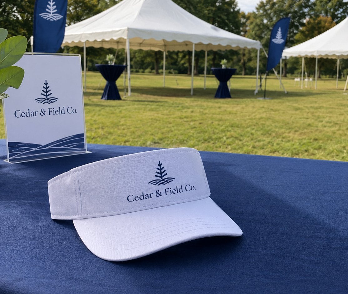
Which decoration method suits my artwork: embroidery or printing?
Embroidery suits artwork with bold shapes, solid colors and heavier lettering, while printing suits artwork with fine detail, gradients, photos or many colors. On a custom visor, the right choice depends as much on the logo as on the fabric of the visor style you choose.
| Artwork trait | Embroidery | Printing |
|---|---|---|
| Bold icon or wordmark | Excellent, raised and textured | Clean and flat |
| Fine lines and small text | Often simplified on the proof | Holds detail well |
| Gradients or photo elements | Converted to solid thread colors | Reproduced closely |
| Many colors | Each color is a separate thread | Handled in one pass |
| Best visor fabrics | Cotton twill, structured fronts | Performance and smooth fabrics |
Fabric matters too. A cotton twill visor gives embroidery a firm base, while a performance sport visor often pairs well with a printed mark that stays light and flexible. A foam trucker visor has a smooth front that takes printed artwork cleanly, and a straw visor usually carries a decorated patch or band rather than direct decoration. Customized Visors will recommend a method on the mockup if your artwork and the chosen style point in different directions.
How do I choose thread and ink colors that show up on a visor?
Choose colors for a visor by matching contrast to the visor color first and your brand palette second. A navy logo on a navy visor disappears no matter how precise the color match is, so the mockup should show your mark on the exact visor color you plan to order.
Useful color rules for custom visors:
- Light visor, dark mark. White, khaki and pastel visors carry dark logos best.
- Dark visor, light mark. Black and navy visors need white, metallic-looking or bright accent colors to stay legible.
- Fewer colors, cleaner result. Simplifying to your core brand colors keeps embroidery crisp and printing sharp.
- Share your brand color codes. Sending Pantone references helps the team pick the closest thread or ink, and the proof shows the result.
If you plan to order the same logo on several visor colors, ask Customized Visors for a reversed version on the mockup. Many brands use a full-color logo on light visors and a single white version on dark ones, which keeps the set consistent without forcing one color scheme onto every visor.
Can I add artwork to the side or brim of a custom visor?
Yes, many custom visor orders add a secondary mark on the side panel or the brim in addition to the front logo. Side and brim placements are a good home for a website, a tagline, an event date written out, a sponsor mark or a small icon that would crowd the front.
Keep secondary artwork smaller and simpler than the front logo. The side of a visor is a narrow strip that curves around the head, and the brim is seen mostly from above or when the wearer looks down, so short text and single-color icons work best there. A terry sweatband visor or a kids’ visor has less room than an adult structured style, which is another reason to let the mockup decide what fits.
Tell Customized Visors every placement you want when you request the quote. Each location appears on the same mockup, so you can approve the whole visor at once instead of discovering a crowded side panel after production.
What artwork mistakes cause the most proof revisions on visors?
The most common visor artwork problems are logos that are too tall, text that is too small and colors that blend into the visor. All of them are easy to fix on the mockup, which is exactly what the proof stage is for.
- Sending a stacked logo only. Include a horizontal version if you have one so the front panel is not forced to shrink your mark.
- Keeping every word. Taglines, legal lines and fine print rarely survive. Decide which words actually need to be on the visor.
- Sending a screenshot. A low-resolution screenshot or a social media avatar slows the redraw. The original logo file from your designer is always better.
- Ignoring the visor color. Approving artwork on a white background and ordering black visors leads to surprises.
- Approving too fast. Check spelling, the placement against the brim, and every side or brim mark before you sign off.
Because Customized Visors offers unlimited free revisions and you pay nothing until you approve, there is no reason to accept a proof that is close but not right.
How does the visor proof and approval process work?
The visor proof process starts when you send your logo and your chosen visor style through the custom quote form. Customized Visors returns a free digital mockup within 24 hours, showing the logo on the actual visor style and color with each placement marked.
- Send your artwork. Include your best logo file, the visor style, the colors you want and any side or brim text.
- Review the mockup. Check size, placement, colors and spelling on the visor you will actually receive.
- Request changes. Ask for as many adjustments as you need. Revisions are free and unlimited.
- Approve and pay. Nothing is charged until you approve the final design.
- Production and delivery. Standard turnaround is about 2 weeks after approval, with faster delivery available through express shipping.
The full sequence is laid out on the how it works page. For a first order, budget time for at least one round of revisions so the visors arrive before your tournament, race or event.
Frequently asked questions
What makes a logo look good on a custom visor?
A logo looks good on a custom visor when it is wide, bold and simple. The front of a visor is a short, curved band, so horizontal lockups with heavy letterforms read clearly from a distance. Fine scripts, small taglines and tall stacked layouts tend to shrink or crowd. Customized Visors shows the result on a free mockup so you can judge legibility before anything is made.
Should I send a horizontal or stacked version of my logo for visors?
Visors almost always suit a horizontal logo better than a stacked one, because the front panel is much wider than it is tall. Send both versions if you have them. The design team can place each on the mockup so you can compare them side by side, then choose the layout that keeps your name largest and easiest to read.
Can a custom visor show a detailed or multicolor logo?
A custom visor can show a detailed or multicolor logo, but the decoration method matters. Printing reproduces fine lines, gradients and many colors closely, while embroidery converts detail into solid thread colors and may simplify very small elements. Customized Visors recommends the method that keeps your artwork faithful and shows the outcome on the mockup before you approve anything.
How small can text be on a visor before it becomes unreadable?
Visor text becomes hard to read once letters get thin or crowded, and the limit is lower for embroidery than for printing. Rather than guessing a size, keep text short, use a heavy font and check the mockup at arm's length. Customized Visors will flag text that looks too fine and suggest a bolder or shorter alternative.
Do visor colors change how my logo should be colored?
Visor color has a big effect on how a logo should be colored. Dark logos need light visors, and dark visors need white or bright marks to stay legible. If you order several visor colors, ask for a reversed or single-color version of your logo for the darker options. Customized Visors shows each color combination on the mockup.
Can I match my exact brand colors on custom visors?
Custom visors can get very close to brand colors when you share Pantone references or official color codes with your artwork. Thread and ink are matched to the nearest available shade, and the mockup shows how the colors sit on the chosen visor fabric. Customized Visors adjusts colors on request until the proof matches your brand standards.
Can different visors in one order carry different names or sponsor marks?
Many custom visor orders keep one main logo and vary a secondary element, such as a sponsor mark on the side or a team name on the brim. Mention every variation when you request your quote so each version appears on its own mockup. Customized Visors confirms the details for each version before production, and the order minimum is 12 visors.
Which visor style is easiest to decorate with embroidery?
A cotton twill visor is usually the easiest visor style to embroider, because the firm, smooth fabric holds stitches cleanly and supports bold logos well. Performance fabrics and foam fronts often pair better with printing. Customized Visors suggests a style and method combination based on your artwork, then shows that pairing on the free mockup.
What should I check on a visor mockup before approving it?
Check every visor mockup for spelling, logo size, placement relative to the brim seam, color contrast against the visor, and any side or brim artwork. Confirm the visor style and color are the ones you want to order. Customized Visors makes unlimited free revisions, so request changes until every detail is right before you approve.
Will my visor artwork be stored for future reorders?
Approved visor artwork is the easiest starting point for a reorder, so keep your final mockup and mention it when you request a new quote. Customized Visors can reuse the approved layout on the same or a different visor style, then send a fresh mockup for you to confirm before anything goes into production.
Can I put a logo on a straw visor?
A straw visor can carry a logo, though the woven surface is not suited to direct printing or fine embroidery. Logos on straw visors are typically applied with a decorated patch or a branded band, which keeps the artwork crisp against the textured straw. Customized Visors shows the patch or band option on a free mockup before you approve.
Get a free mockup for your visors
Send your logo or idea and the quantity you have in mind. Customized Visors returns a free mockup within 24 hours, you approve the design before anything is produced, and standard turnaround is about two weeks with faster options available. Get a custom quote.